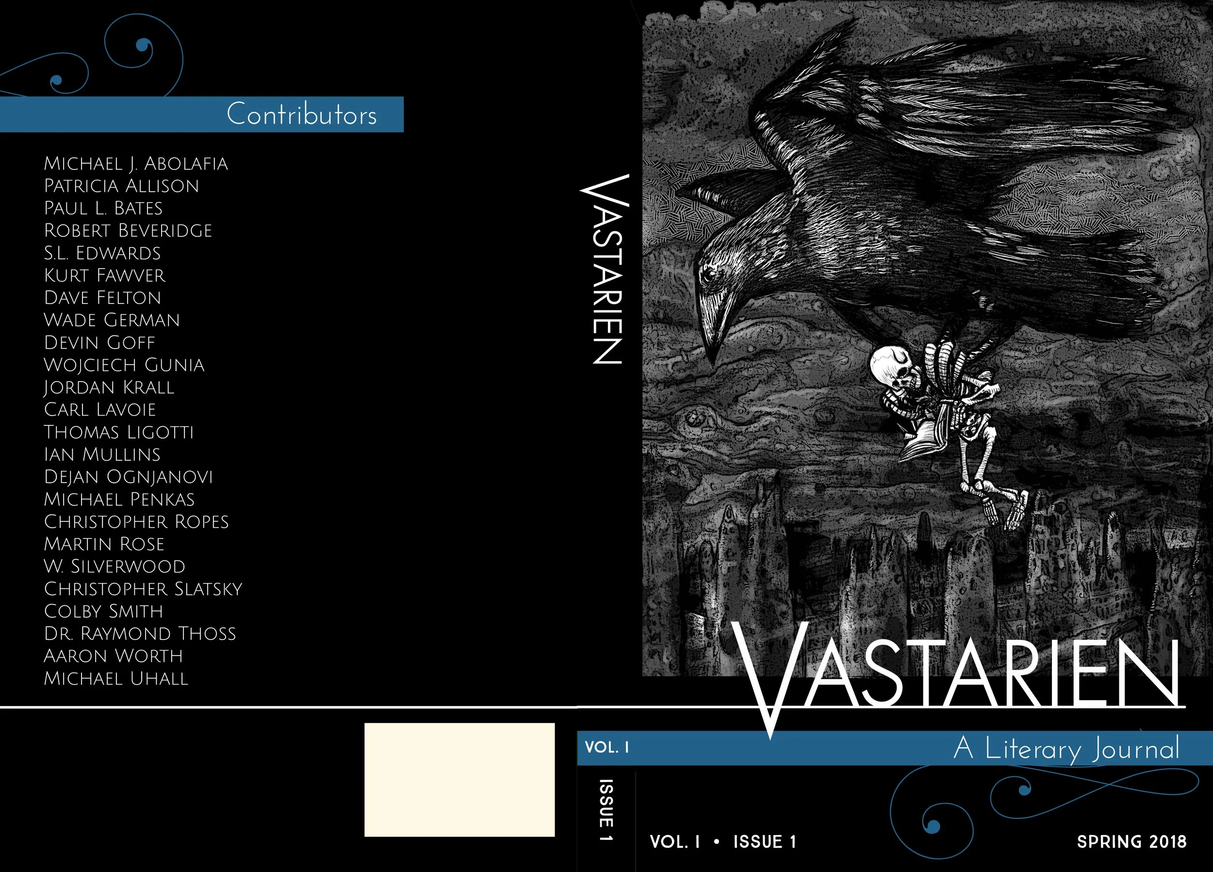
Vastarien: A Literary Journal
THE MISSION → Create a look for this new periodical that is elegant, clean, and appropriate for the subject matter and genre (modern horror).
For this project, I liked the contrast of the modern, slick design against the chunky terrors included in the stories inside. It was important to the editor to communicate that in most cases, these were new works from contemporary authors.
I suggested that the coverstock used for printing have a soft, eggshell finish, so that the inky darks seem to suck in the light when you see the book in-person, and also the texture feels really, really nice in your hand.
In moving forward with the design, we agreed that changing the color bars each year (volume) would be a simple and effective way to differentiate one volume from another.
This is my artwork as well →


